Pantone vs CMYK printing has long been a discussion in the world of packaging design, branding, and color management. Both methods play an essential role in how businesses produce their printed materials, from packaging and business cards to flyers and promotional products. However, choosing between the two can be challenging if you don’t understand how they work and what benefits each offers.
Colors are one of the first things customers notice about a product. The right color combination can influence brand recognition and emotional connection. In packaging, consistent color reproduction is not just a design choice—it is a branding necessity. Understanding which printing method to use is key to achieving accuracy, consistency, and quality in every print run.
For a more in-depth look at how these two systems differ and which fits your business best, you can explore this guide on Pantone vs CMYK.
Understanding the Basics of Color Printing
Printing colors is more than just mixing inks. It’s about creating a visual experience that matches the designer’s vision on screen and the physical result on paper or packaging. The two main color systems—Pantone and CMYK—operate differently in how they create and reproduce colors.
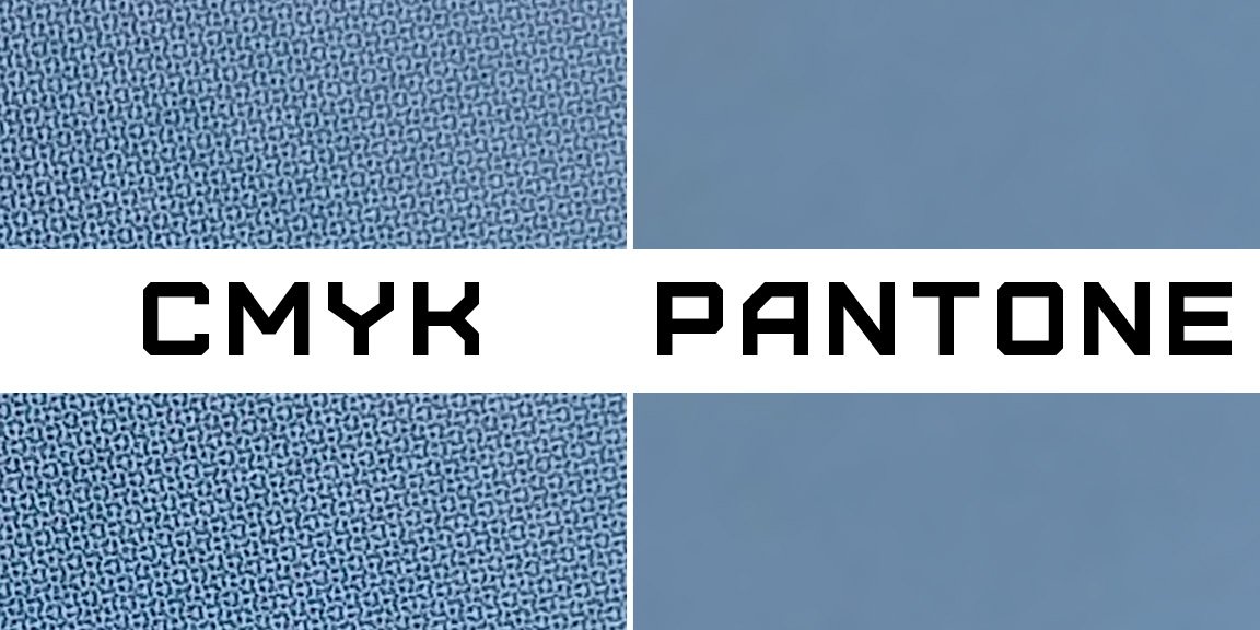
What Is CMYK?
CMYK stands for Cyan, Magenta, Yellow, and Black. This method uses these four base colors to create a wide range of hues. The colors are layered during printing, blending in various intensities to produce different shades. It’s the standard model used for most digital and offset printing.
The CMYK method is perfect for full-color prints such as brochures, magazines, and packaging with detailed images or gradients. However, since the colors are created through blending, achieving perfect consistency across multiple print runs can be challenging.
What Is Pantone?
Pantone, also known as the Pantone Matching System (PMS), is a standardized color system that uses specific color codes for each hue. Instead of mixing four inks, Pantone colors are pre-mixed to ensure accuracy. This makes them ideal for printing logos, brand designs, and packaging that require exact color matches.
Pantone colors are commonly used in industries where brand consistency is crucial, such as cosmetics, fashion, and food packaging. Designers can specify a Pantone code, and printers around the world can reproduce the same color without variation. more
Why Color Accuracy Matters in Packaging
Color is the silent ambassador of your brand. A consistent shade across your product line builds recognition and trust. When the same product looks slightly different in color from one batch to another, it affects your brand perception. This is why businesses take printing color systems seriously.
Accurate color printing helps:
-
Maintain brand consistency across packaging and marketing materials.
-
Improve customer recognition and loyalty.
-
Create visual harmony between digital designs and printed versions.
-
Reduce waste and cost due to fewer reprints.
Pantone vs CMYK: The Core Differences
While both printing systems aim to produce visually stunning results, they function differently and serve distinct purposes. Let’s break down the differences between Pantone and CMYK.
1. Color Creation Process
CMYK creates colors by blending four inks in various ratios. Each color is printed as tiny dots that combine visually to form the final color. Pantone, on the other hand, uses solid inks pre-mixed to a specific formula, producing colors that are exact and consistent every time.
2. Color Accuracy
Pantone printing ensures precise color matching since it’s based on a standardized formula. CMYK can sometimes result in minor variations depending on printer calibration, paper type, or ink quality.
3. Range of Colors
CMYK has a wide color range but cannot reproduce certain bright or metallic shades. Pantone includes special inks for metallics, fluorescents, and pastel tones, which are impossible to achieve with CMYK.
4. Cost Consideration
Pantone printing is often more expensive because it requires custom ink mixing and setup. CMYK is more economical for large-volume printing where multiple colors and gradients are used.
5. Printing Application
Pantone is perfect for logos, labels, and branded packaging where color consistency is non-negotiable. CMYK works best for photographs, illustrations, and complex designs requiring full-color printing.
When to Use Pantone Printing
Pantone printing is the go-to choice when brand color accuracy is the top priority. Here are some ideal use cases:
-
Printing corporate logos or symbols that require exact brand colors.
-
Creating packaging for high-end or luxury products.
-
Designing promotional items where color consistency enhances brand recognition.
-
Producing limited-edition packaging that uses metallic or fluorescent finishes.
Pantone also helps designers achieve special finishes that stand out on store shelves, such as metallic silver, gold, or neon hues that catch the eye.
When to Use CMYK Printing
CMYK printing is a practical choice for projects requiring vibrant imagery and multiple color combinations. It’s suitable for:
-
Marketing materials such as brochures and flyers.
-
Packaging with photographic or gradient designs.
-
High-volume printing where cost efficiency matters.
-
Custom boxes with creative artwork and detailed designs.
CMYK printing is reliable and widely used across industries due to its cost-effectiveness and flexibility in handling detailed visuals.
Benefits of Pantone Printing
-
Ensures precise color consistency across print materials.
-
Offers a vast selection of unique shades and special finishes.
-
Ideal for brand identity elements that need uniformity.
-
Reduces the risk of color mismatch in multiple production batches.
Benefits of CMYK Printing
-
Cost-effective for bulk printing jobs.
-
Delivers vibrant and dynamic visuals.
-
Excellent for complex graphics, photos, and gradients.
-
Compatible with most printing technologies.
Comparing Pantone and CMYK in Packaging Design
Packaging design is about creativity, consistency, and communication. The choice between Pantone and CMYK impacts how your final packaging looks and how well it represents your brand.
Pantone printing provides a luxurious touch with precise color tones, making it perfect for premium brands. Your Box Packaging CMYK allows for creative freedom with full-color designs suitable for retail packaging and promotional campaigns.
How to Decide Which Method Is Right for You
Selecting between Pantone and CMYK depends on your business goals, budget, and packaging type. Consider these factors before deciding:
-
Brand identity: If you need your brand colors to remain consistent across all platforms, Pantone is ideal.
-
Budget: For large runs and detailed graphics, CMYK offers a better balance of cost and quality.
-
Packaging material: The material you print on can affect how colors appear; Pantone provides more control for specialty materials.
-
Print volume: Small, high-quality runs benefit from Pantone, while large-scale production favors CMYK.
Common Mistakes to Avoid
Many businesses make the mistake of assuming that what they see on the computer screen will match their printed result. Digital screens use RGB color models, which display a wider color range than either CMYK or Pantone can reproduce. Always request color proofs before final printing to ensure accuracy.
How Designers Use Both Systems
In some cases, designers use a mix of both Pantone and CMYK for optimal results. For example, they might use Pantone for the brand logo and CMYK for the rest of the packaging design. This hybrid approach balances color precision with creative flexibility.
Bullet Point Summary: Key Takeaways
-
Pantone offers exact color matching through pre-mixed inks.
-
CMYK blends four base inks to create a broad range of hues.
-
Pantone is ideal for consistent branding and specialty finishes.
-
CMYK is perfect for vibrant images and large-scale printing.
-
The right choice depends on your design needs, materials, and budget.
The Future of Printing Technology
With the rise of digital printing technologies, the gap between Pantone and CMYK is narrowing. Many printers now use expanded color gamut systems that incorporate additional inks, offering even more accuracy and vibrancy. Brands can now achieve high-quality prints while staying eco-friendly and cost-efficient.
Sustainability also plays a growing role in color printing. Eco-friendly inks and recyclable materials are becoming more popular, aligning with consumer demand for responsible packaging.
Conclusion
Both Pantone and CMYK have unique advantages that cater to different design and printing needs. Choosing between them depends on your priorities—whether it’s precision, cost-efficiency, or design versatility. Understanding their strengths helps you create packaging that accurately reflects your brand and captures customer attention.
For brands looking to achieve professional and consistent printing results, partnering with experts who understand both systems is essential. The key is to balance creative vision with technical precision, ensuring every color printed aligns with your brand’s identity.

Leave a Reply