In the world of visual design and branding, color plays an essential role in shaping perception and emotion. Whether you’re creating a digital ad or printing packaging for a product, selecting the right color model determines how your final design will appear. Two primary systems dominate color reproduction — RGB and CMYK. Understanding their distinctions is crucial to maintaining color accuracy across platforms and ensuring your brand visuals stay consistent everywhere.
Understanding the Basics of RGB and CMYK
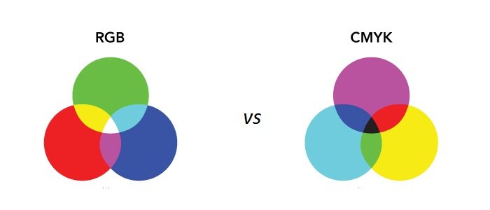
Before diving into the RGB vs CMYK comparison, it’s important to grasp what each color model represents. RGB stands for Red, Green, and Blue, while CMYK stands for Cyan, Magenta, Yellow, and Key (Black). These two models work differently because they’re designed for different mediums. RGB is used for digital screens, where light is the source of color, while CMYK is used in printing, where pigments and inks form the visual output.
Each model creates color in its unique way. RGB blends light to produce bright, luminous hues — the more color you add, the lighter the final result. On the other hand, CMYK works through the subtraction of light; the more ink added, the darker the color becomes. This fundamental difference defines their application in the design industry.
The Role of RGB in Digital Design
The digital color model (RGB) is essential for all screen-based visuals — websites, mobile apps, digital advertisements, and social media content. Since RGB uses light as its base, it produces a wider range of vibrant colors than CMYK can replicate. This model allows designers to experiment with intense saturation and glowing effects that stand out on backlit displays.
The RGB color spectrum is exceptionally vast. It can create millions of color variations by adjusting the intensity of its three primary hues. For example, combining red and green creates yellow, while mixing all three at full intensity produces white. This versatility is what makes RGB ideal for creating eye-catching, luminous visuals in digital environments.
However, problems occur when RGB designs are printed without proper conversion. What appears vivid on-screen may look dull or muted in print. That’s where CMYK steps in — the trusted model for tangible media. more
Why CMYK is the Foundation of Print Design
For printed materials, the CMYK printing process is the industry standard. Instead of emitting light, this model uses layers of colored ink to reflect light from paper or packaging material. Each layer interacts with the one beneath it, forming a full-color image through precise blending.
Because print media doesn’t rely on light, its color range (gamut) is smaller than RGB’s. This is why bright neon or glowing effects seen on screens are difficult to reproduce in print. Designers must convert digital RGB files into CMYK before printing to ensure color accuracy and avoid unexpected results.
In packaging design, particularly in industries like cosmetics, food, or retail, CMYK ensures consistent tones across all physical materials — from boxes to labels. The precision of this process maintains brand integrity, ensuring that every printed product matches the designer’s intended look.
Key RGB and CMYK Differences
The RGB and CMYK differences are based on their color creation methods and intended mediums. RGB is additive — it starts with black and adds light to create color. CMYK is subtractive — it starts with white (paper) and subtracts light using ink layers.
Here’s a brief comparison:
- RGB: Used for digital screens, brighter visuals, and glowing effects.
- CMYK: Used for print, accurate ink blending, and material-based designs.
- RGB output: Seen on devices.
- CMYK output: Seen in print materials like packaging, brochures, or business cards.
Designers working across both mediums must plan their color strategy early to ensure consistency. Software like Adobe Photoshop and Illustrator offer color profile settings that help manage this transition seamlessly.
Color Accuracy and Brand Consistency
Color consistency is a key part of professional branding. When a customer sees a logo or product package, the color triggers immediate recognition. If that shade appears differently on-screen versus in print, it can harm brand perception. That’s why understanding the right color model is not just a technical step — it’s a strategic branding decision.
For digital marketing campaigns, sticking with RGB ensures dynamic visuals. But for physical marketing materials like posters, packaging, and brochures, converting to CMYK before production preserves your design’s intended tone and depth.
Choosing the Right Color Model for Your Project
The choice between RGB and CMYK depends entirely on your output medium. If your design will live on screens — websites, social media, digital ads — RGB is the correct choice. But if it’s heading to print — product labels, business cards, or packaging — CMYK is non-negotiable.
Designers often create in RGB for flexibility and then convert to CMYK before final printing. However, this process requires careful calibration because some colors in RGB don’t exist in CMYK’s narrower spectrum. Using Pantone color guides or professional proofing services can help bridge this gap effectively.
The Role of Custom Product Packaging in Color Precision
In the modern marketplace, color accuracy doesn’t end with digital files — it extends to how your packaging represents your brand. Whether you’re producing cosmetic boxes, food packaging, or retail displays, the harmony between design and material is critical.
Brands that invest in custom product packaging gain control over every visual aspect — from ink selection to texture and finish. This ensures that their packaging not only protects the product but also delivers a consistent visual message across all platforms. By aligning CMYK color profiles with the chosen material, designers can guarantee that the printed tones reflect the same richness as seen in digital proofs.
In high-end packaging, small details like foil stamping, embossing, or spot UV coating can enhance CMYK prints without compromising color fidelity. These finishing touches work hand-in-hand with well-calibrated color models to create a luxurious and professional final product.
Integrating Digital and Print Consistency
As brands expand across both physical and digital spaces, mastering the connection between RGB and CMYK becomes essential. Custom product packaging plays a key role in this integration — it serves as the physical embodiment of digital branding.
For example, a brand’s vibrant RGB-based logo should translate seamlessly to printed packaging. Achieving that harmony requires collaboration between designers and printing specialists, ensuring the CMYK process accurately mirrors digital intent. The result is cohesive brand recognition, whether a customer sees the product online or holds it in their hands.
Conclusion
The RGB vs CMYK comparison reveals that both color models serve unique purposes but share a common goal — to communicate brand identity effectively. RGB thrives in digital environments where light defines vibrancy, while CMYK excels in print, turning digital creativity into tangible form.
Understanding when and how to use each model allows designers and businesses to maintain color integrity and brand consistency across every platform. By combining smart design strategies with precision printing and custom design packaging, brands can ensure their visuals always stand out — in every medium, on every surface.


Leave a Reply